Brand guidelines
Logo, mark, icons, colour, type and the rules that hold them together. Every logo downloads as SVG and PNG, or grab the whole kit in one go.

- Kit
- 15 logos, SVG and PNG
- Size
- 0.8 MB zip
- Type
- Funnel Display, Funnel Sans
- Accent
- Violet #7C38EE
01 · Principles
Five rules behind every page.
The brand sells one idea: growth comes from a system, not from more activity. The design has to look like that system: ordered, measured and calm.
- 01
Systems, not decoration
Every element has to explain, guide or prove something. If it only decorates, it goes.
- 02
One accent
Violet is the only colour that speaks. Everything else is ink, snow and the greys between them.
- 03
Numbers over adjectives
Show the figure, where it came from and how it links to revenue. Never "amazing results".
- 04
Dark to open, light to explain
Pages open on an ink hero and do their explaining on snow. Contrast marks the change of pace.
- 05
Calm motion
Movement reveals structure: words rise, links draw, cards settle. Nothing bounces, and reduced-motion settings are respected.
02 · Logos
An arrow that bends toward the number.

The mark is an arrow pointing up and to the right, the direction every chart in a board deck should go. Its two arms curve inward and meet at one sharp point: separate efforts, pulled into a single direction by the system. The wordmark is the domain itself, rahuldsarker.co, with the dot in violet as the one bit of colour.
Primary lockup
Mark and wordmark together. The default for decks, documents, email signatures and partner pages.


Wordmark
Where the mark already appears nearby, or space is wide and short.




Mark
The arrow on its own, for small or square spaces once the name is already known.



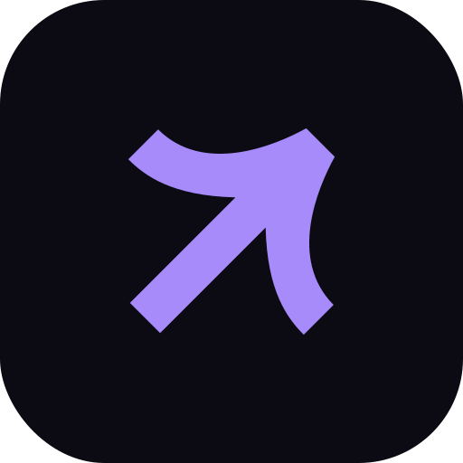
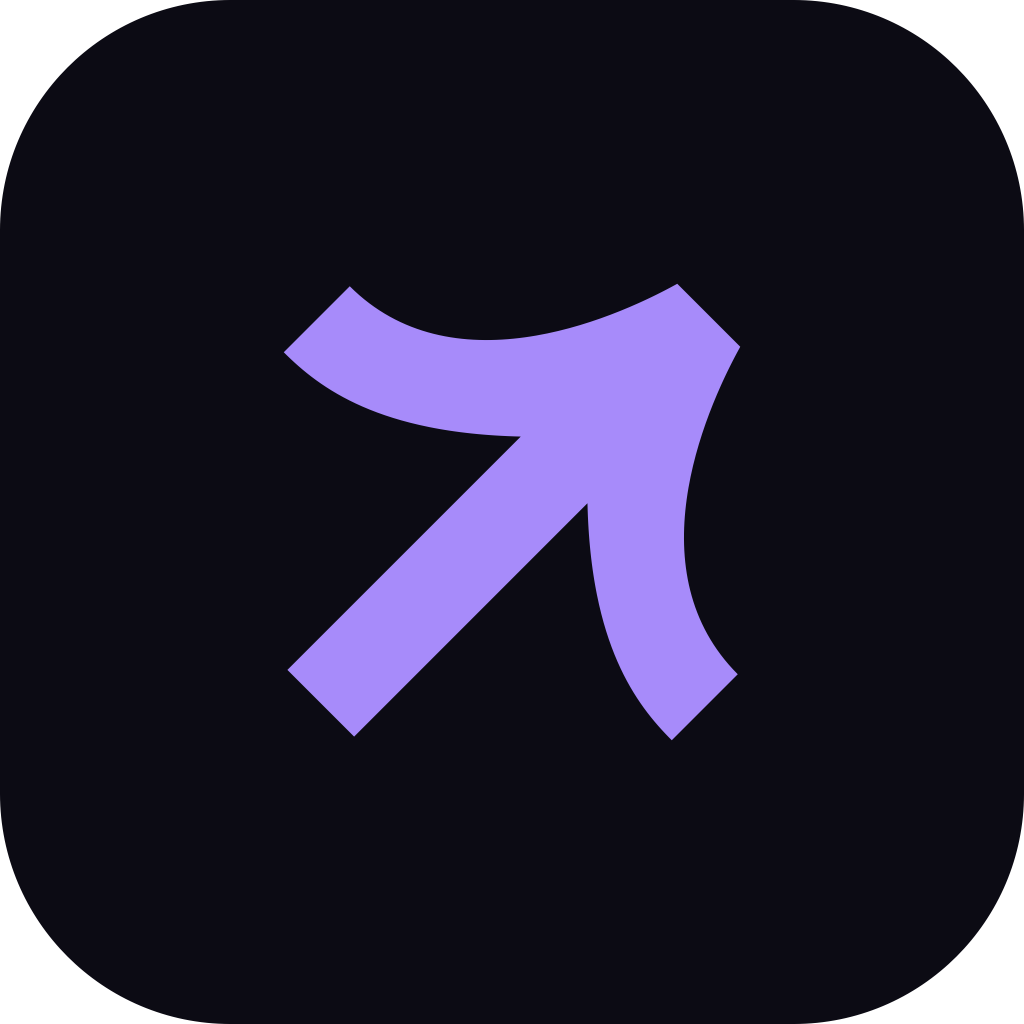
App icons and avatars
Ready-made tiles for favicons, social avatars, app icons and calendar invites.

















Need all of it?
Every file above in one zip: vectors, transparent PNGs and a short readme.
03 · Usage
Room to breathe, and a few hard noes.
Clear space
Keep a margin of xon every side, where x is a quarter of the mark's height. For the lockup, measure x from the mark. No text, edges or other logos inside it.
Minimum size
Mark: 16 px on screen, 5 mm in print. Wordmark: 96 px wide, 25 mm in print. Lockup: 128 px wide, 35 mm in print. Below that, use the mark alone.
Approved backgrounds
Snow, Ink, Violet and Lilac, each with its matching logo colour. On photos, use the white logo over a dark, quiet area of the image.
Don't
Stretch or squash it
Rotate it; the arrow always points up and right
Recolour it outside the palette
Add shadows, glows or gradients
Put it on busy or low-contrast backgrounds
Outline it
Retype the wordmark in another font
Rearrange or resize parts of the lockup
04 · Colour
Ink, snow and one violet.
Roughly 60% neutral surface, 30% text and structure, 10% violet. If a screen feels colourful, there is too much violet on it. Click any value to copy it.
Primary
- Violet
- Ink
- Snow
Supporting
- Violet Deep
- Lilac
- Mist
- Ink 2
- Snow 2
- Slate
- Haze
- Alarm
Contrast
- AaInk on Snow18.8:1 pass
- AaWhite on Violet5.7:1 pass
- AaViolet on Snow5.5:1 pass
- AaMist on Ink10.1:1 pass
- AaInk on Lilac7.2:1 pass
- AaViolet on Ink3.4:1 large text only
On dark backgrounds, violet text fails accessibility checks. Use Mist for links and accents on Ink, and keep Violet for buttons with white labels.
05 · Typography
Two families, one voice.
Aa
Funnel Display
Headlines, numbers and big statements. Medium (500), tracked tight at −3%.
Get it from Google Fonts ↗Aa
Funnel Sans
Body copy, interface and labels. Regular (400) to read, Semibold (600) to emphasise.
Get it from Google Fonts ↗Aa
Inter Bold
The wordmark only, and never retyped: use the logo files. Not for headings or body text.
Get it from Google Fonts ↗- Display · 64–88Revenue systems.
- H2 · 34–58One owner of the number.
- H3 · 26–35Strategy without execution
- Lede · 17–20Most teams arrive with one of three broken links.
- Body · 16Campaigns run, but nothing ties spend to revenue. Every Monday is a channel-credit argument.
- Sentence case for every heading, button and label. No all-caps.
- No em dashes. Use a full stop, a comma or a colon.
- Numbers as figures: 38%, $25K, 3 minutes. They are the proof.
- Headlines end with a full stop when they are a statement.
06 · Voice
Write like the operator in the room.
Plain, specific and a little blunt. Write for a founder or CFO who has heard every agency pitch: short sentences, real numbers, no hype.
SayPipeline up 38% in two quarters, attributed in the CRM.
NotSupercharge your growth with data-driven magic!
SayThree agencies. Nobody owns the number.
NotWe leverage synergies across best-in-class channel partners.
SayBook a diagnostic call
NotClick here to unlock your FREE strategy session today!!!
07 · Interface
The pieces every page is built from.
Primary button
Violet pill, white label, one per view. It always leads to the booking calendar or the main action.
Text link
The secondary action. Underlined, with the line redrawing on hover.
Pills
Tags and filters. Rounded, hairline border, sentence case.
Stat card
Label small, number large in Funnel Display. Numbers carry the argument.
- Corner radius
- 999 px pills · 16–24 px cards · 14–16 px icon tiles
- Easing
- cubic-bezier(0.22, 1, 0.36, 1), 0.4–0.9 s
- Page width
- 1200 px content, gutters 20–48 px
- Hairlines
- Ink at 12% on light, white at 10% on dark
Using the brand for something new?
Partner pages, event listings and press features are welcome. Email hey@rahuldsarker.coif you need a format that isn't here, or want a quick check before it goes out.
Download the brand kit ↓